Code
Data visualization is the graphical representation of information and data. By using visual elements like charts, graphs, and maps, data visualization tools provide an accessible way to see and understand trends, outliers, and patterns in data. Here’s a more detailed look at data visualization, including some common types of visualizations and examples.
Clarity and Efficiency: Data visualization helps to explain facts and determine causes faster than raw data can. This is particularly valuable in a business context, where strategic decisions are based on data insights.
Trend Recognition: Visuals can highlight trends and correlations more effectively than tables of numbers, which in turn can lead to more effective decision-making.
Data-Driven Storytelling: Visuals can be used to narrate a story from the data, making the conveyed messages more engaging and understandable.
Line Graphs: Useful for showing changes over time. For example, a company might use a line graph to track its revenue growth across several quarters.
Bar Charts: Effective for comparing quantities among different groups. For instance, a bar chart could compare the sales performance of different products within a portfolio.
Pie Charts: Suitable for showing percentages or proportions. A market research company might use a pie chart to illustrate the market share of different competitors.
Scatter Plots: Used to identify relationships between variables. For example, an economist might use a scatter plot to analyze the relationship between unemployment rates and economic growth.
Heat Maps: Great for representing the intensity of data. Heat maps could be used to show areas of high activity on a website, or to depict geographic concentrations of a population.
Infographics: Combine various types of visualizations into a single cohesive graphic that tells a story or explains complex data sets succinctly.
Geographic Maps: Enhanced with layers of data to provide spatial context. These are often used in environmental studies and logistics.
Gantt Charts: Utilized primarily for project management to visualize project schedules, showing the duration of tasks against the progression of time.
Dashboards: Interactive interfaces that dynamically display data and allow users to filter and manipulate information quickly.
Google Analytics Dashboards: Show web traffic sources, page views, and user engagement metrics across various demographics.
Public Health Visualizations: Like those used by the World Health Organization or the Centers for Disease Control and Prevention, to show occurrences of diseases like COVID-19, their spread, and vaccination rates across different regions.
Financial Market Charts: Such as those seen on Bloomberg or CNBC, where complex financial data like stock performances, market indices, and economic indicators are updated in real-time.
Social Media Insights: Platforms like Facebook and Twitter provide users with detailed charts and graphs on post engagements, audience growth, and activity patterns.
A scatter plot (or scatter diagram) is a type of plot or mathematical diagram using Cartesian coordinates to display values for typically two variables for a set of data. The data is displayed as a collection of points, each having the value of one variable determining the position on the horizontal axis and the value of the other variable determining the position on the vertical axis.
Example of a Scatter Plot: Imagine you have a dataset with the ages of a group of people and their corresponding systolic blood pressure readings.
Importance:
Relationships: Scatter plots are particularly useful for determining the relationship or correlation between two variables. This can be especially helpful in spotting trends, clusters, and outliers.
Correlation detection: They make it easy to see if an increase in one variable correlates with an increase in another (positive correlation), a decrease in another (negative correlation), or no correlation.
A scatter plot can be used to visualize any correlation between age and blood pressure.
The scatter plot might show that as age increases, blood pressure also tends to increase, indicating a positive correlation.
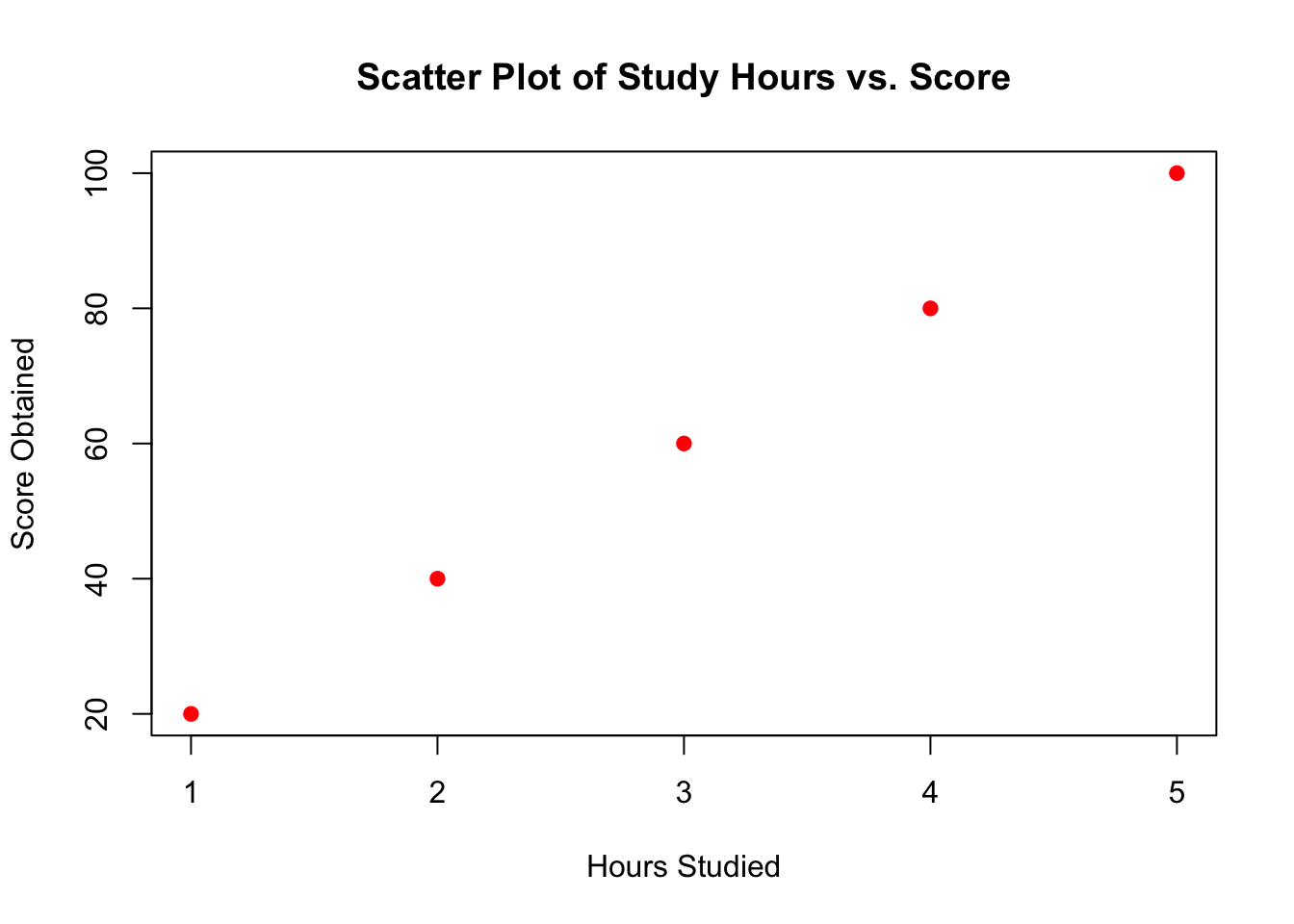
Let’s take an example dataset that includes hours studied and scores obtained by students to demonstrate how to create a scatter plot using both R and Python.
| Hours Studied | Score Obtained |
|---|---|
| 1 | 20 |
| 2 | 40 |
| 3 | 60 |
| 4 | 80 |
| 5 | 100 |
We’ll visualize this data to see if there’s a correlation between the number of hours studied and the scores obtained.
In R, you can use the plot() function from the base package to create a scatter plot.
In above example, you define two lists or vectors: one for the hours studied and one for the scores obtained. Then you use plotting functions to create a scatter plot where each point’s position on the plot corresponds to a pair of values from these lists. The title, xlabel, and ylabel provide labels for clarity. The scatter plot will show a clear positive linear relationship, suggesting that higher study hours might be associated with higher scores.
A histogram is an accurate representation of the distribution of numerical data. It is an estimate of the probability distribution of a continuous variable (quantitative variable) and was first introduced by Karl Pearson. A histogram consists of contiguous (adjacent) boxes. It groups numbers into ranges (bins). The height of each box depicts the number of data points that fall within each range.
Importance:
Distribution: Histograms provide a visual interpretation of numerical data by indicating the frequency of data points within certain ranges of values. This helps in understanding the distribution (e.g., normal distribution, skewed, bimodal) of the data.
Outliers and shape: They help identify outliers and the overall shape of the data distribution, which are critical in statistical analyses and assumptions required for applying various statistical tests and models.
Example of a Histogram: Consider you have data on the test scores of students in a particular exam. The histogram can show how many students achieved scores within certain score ranges (e.g., 0–10, 11–20, etc.).
From the histogram, you might observe most students scoring between 50 and 70, which could indicate the test’s difficulty level or the average student’s preparedness.
These visual tools help researchers, analysts, and businesses to analyze large amounts of data quickly and effectively, making informed decisions based on visual insights.
Sure, let’s continue with the theme of students’ scores, but this time, let’s imagine a larger dataset representing the distribution of scores on a test. Here’s the example dataset we’ll use for creating histograms:
| Scores |
|---|
| 55 |
| 70 |
| 65 |
| 85 |
| 90 |
| 75 |
| 60 |
| 95 |
| 80 |
| 70 |
| 65 |
| 50 |
In R, you can use the hist() function from the base package to create a histogram.
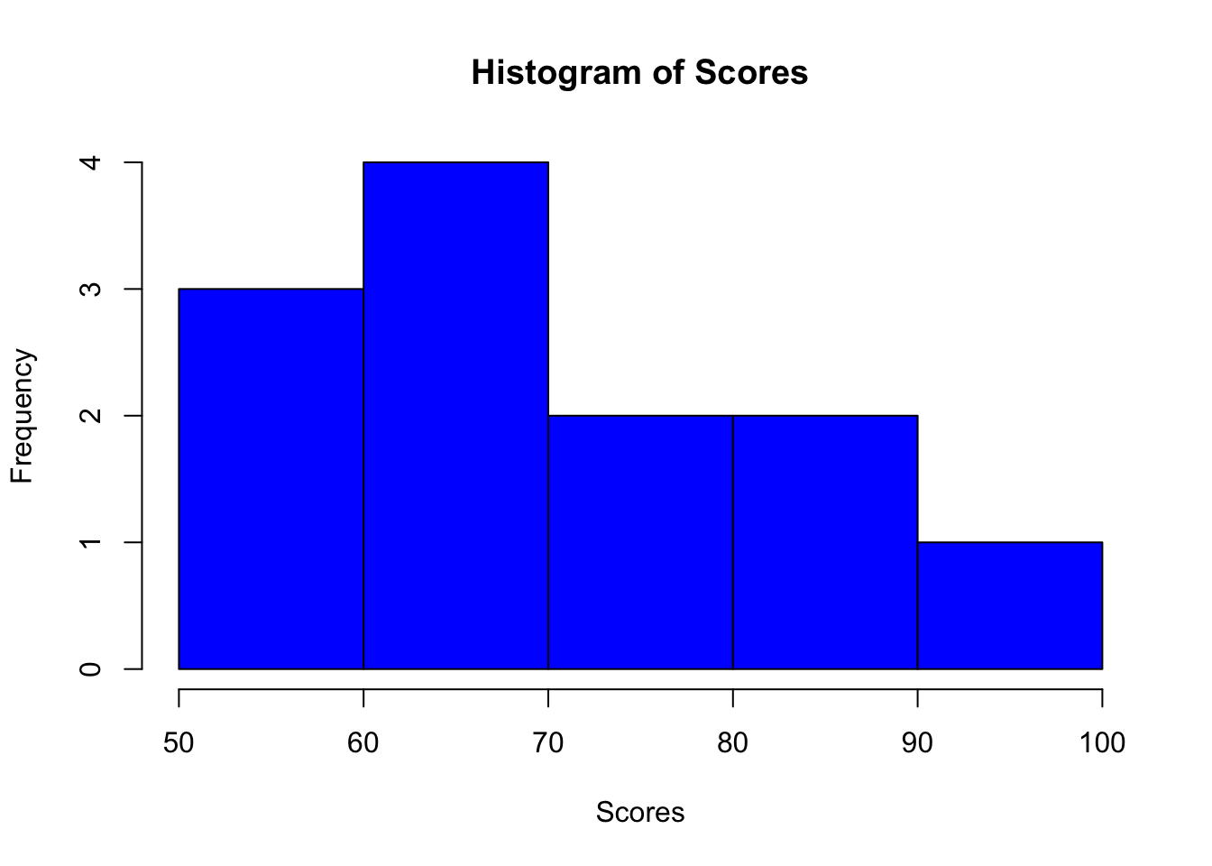
This code snippet creates a histogram with 5 bins (groups of scores). The color of the bars is set to blue, and labels are added for clarity.
Bar charts are a staple of data visualization, used extensively to compare data across different categories. They are simple yet powerful tools for presenting categorical data with rectangular bars, where the length of each bar is proportional to the value it represents.
Bar charts can be classified into three types:
Simple Bar Chart: Displays data with simple bars placed at equal distances apart. Each bar represents a single value for a particular category.
Sub-divided (Stacked) Bar Chart: Shows multiple categories stacked on top of each other within a single bar. Each segment of the bar represents a sub-category of the overall category.
Multiple Bar Chart: Places bars next to each other rather than stacking, with each bar representing a different sub-category within the main category.
Structure:
A simple bar chart displays rectangular bars with lengths proportional to the values they represent. The bars are plotted either vertically or horizontally. A vertical bar chart is sometimes called a column chart. Each bar represents a single category, and the height or length of the bar corresponds to the data value.
Purpose:
Comparison: Simple bar charts are primarily used to compare the magnitude of values across different categories, making it easy to see which categories are larger or smaller. Clarity: They provide a clear, straightforward visualization of data, where the focus is on comparing single data points between individual categories.
Structure:
A stacked bar chart also displays rectangular bars, but each bar is divided into sub-sections that stack on top of each other vertically. Each sub-section represents a different sub-category within the main category.
Purpose:
Part-to-Whole Relationships: Stacked bar charts are used to show how different parts contribute to a whole across different categories. Comparison: While they allow comparison of the total sizes across categories, they are especially useful for comparing the segments within those totals.
# Data
categories <- c("Breakfast", "Lunch", "Dinner")
values1 <- c(20, 25, 30) # Eggs
values2 <- c(10, 15, 20) # Bacon

# Stacked Bar Chart
barplot(rbind(values1, values2), beside=FALSE, col=c("yellow", "red"),
        legend.text=c("Eggs", "Bacon"), names.arg=categories,
        main="Stacked Bar Chart", ylab="Quantity")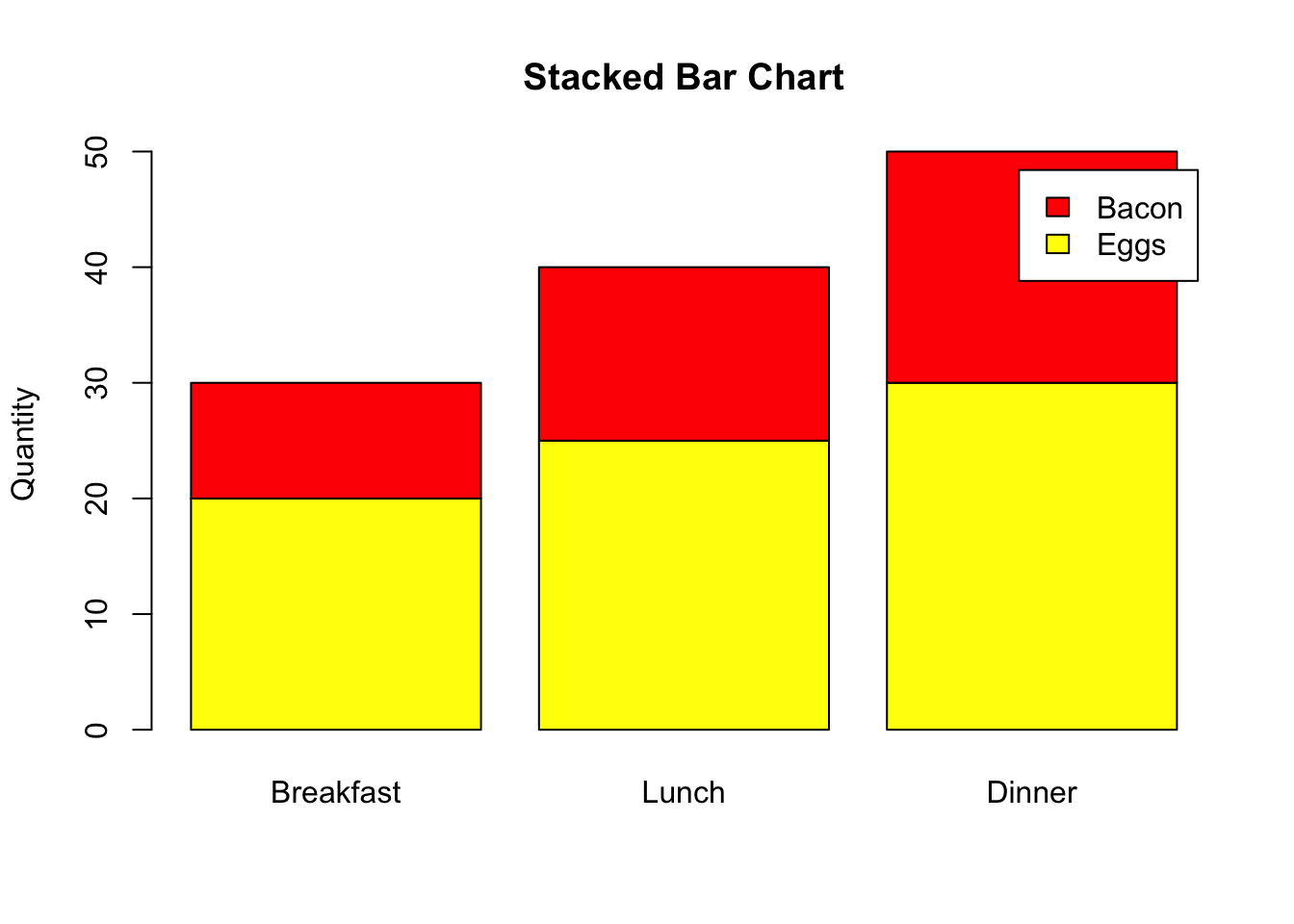
Structure:
Multiple bar charts, or grouped bar charts, feature separate bars for each sub-category, placed next to each other rather than stacked. These are plotted across the same categories for ease of comparison.
Purpose:
Comparative Analysis: They are ideal for comparing multiple sub-categories across the same main categories. Visibility: Grouped bar charts provide a clear view of differences within categories, making it easier to compare each sub-category side by side without the complication of stacking.
# Data
categories <- c("Breakfast", "Lunch", "Dinner")
values1 <- c(20, 25, 30) # Eggs
values2 <- c(10, 15, 20) # Bacon

# Multiple Bar Chart
barplot(rbind(values1, values2), beside=TRUE, col=c("green", "orange"),
        legend.text=c("Eggs", "Bacon"), names.arg=categories,
        main="Multiple Bar Chart", ylab="Quantity")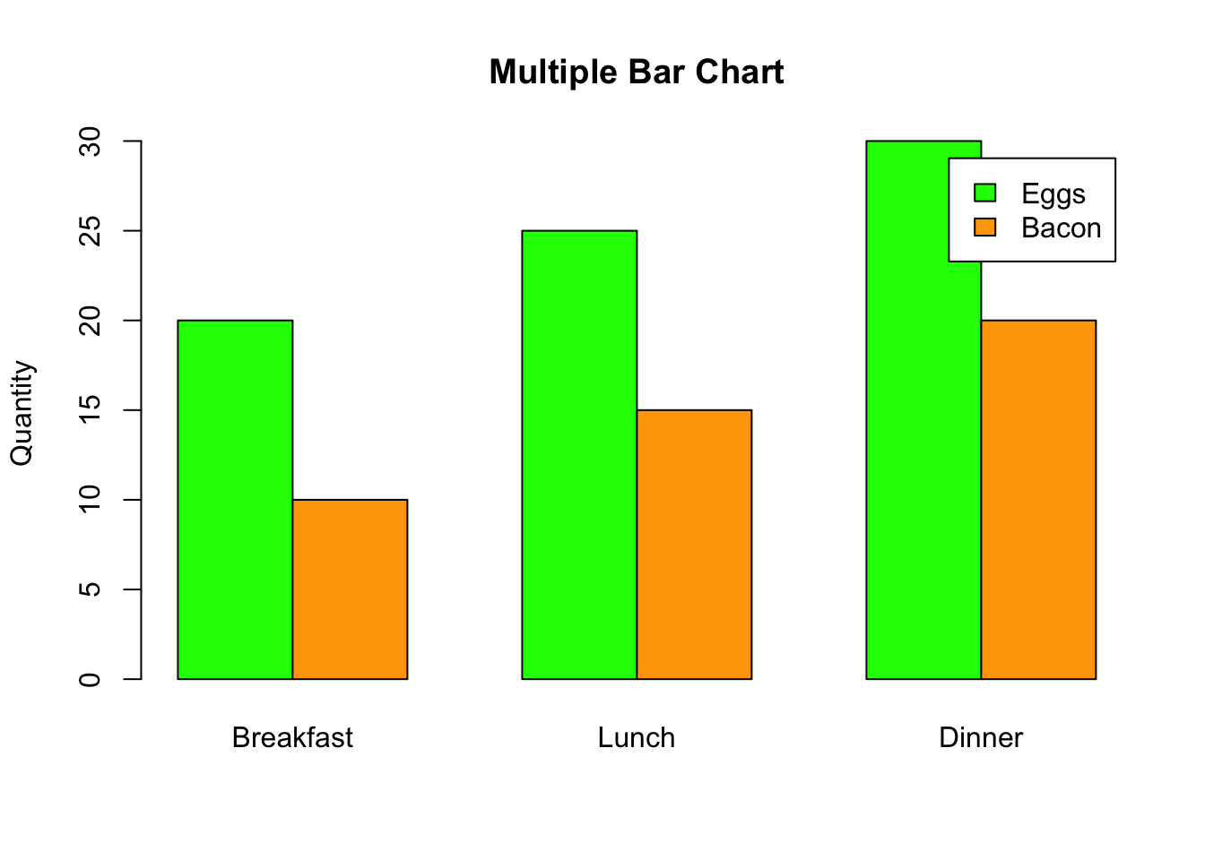
Each type of bar chart serves different purposes and provides a clear visual differentiation of data. Depending on your specific needs—whether comparing total quantities, proportions within categories, or relationships between sub-categories—each format offers a tailored approach.
Line plots (or line graphs) are a staple in data visualization, particularly useful for displaying data trends and variations over time. They help data analysts understand how data points connect over a period or sequence, which is crucial for identifying patterns such as trends, cycles, and potential anomalies.
Trend Identification: Line plots are excellent for observing trends in data across time, such as sales data over the months or years, temperature changes through seasons, or stock market fluctuations.
Comparison: Analysts can plot multiple lines on the same graph to compare trends across different categories or groups, making it easier to evaluate relative performance or behaviors.
Temporal Changes: Line plots are inherently suited to data that changes continuously and is dependent on a sequential order, particularly time series data.
Smoothing and Forecasting: They can be used to apply smoothing techniques to reduce noise and better highlight underlying trends, and to project future values based on historical data trends.
In R, you can use the ggplot2 package, which provides a powerful framework for building line plots and other types of visualizations. First, make sure ggplot2 is installed:
install.packages("ggplot2")library(ggplot2)
# Create a data frame with monthly sales data
data <- data.frame(
Month = factor(c('Jan', 'Feb', 'Mar', 'Apr', 'May', 'Jun'), levels = c('Jan', 'Feb', 'Mar', 'Apr', 'May', 'Jun')),
Sales = c(200, 210, 190, 215, 205, 230)
)
# Plotting the line graph
ggplot(data, aes(x=Month, y=Sales)) +
geom_line(group=1, colour="blue") +
geom_point() +
labs(title="Monthly Sales Data", x="Month", y="Sales") +
theme_minimal()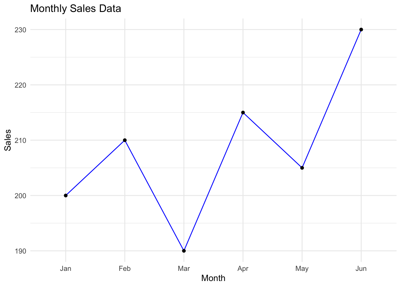
The line plot helps visualize how sales change month-over-month. Adjustments and additional analytical techniques can be applied to these plots for more detailed exploration, such as adding trend lines, plotting multiple categories, or analyzing seasonal effects. Line plots serve as a basic yet powerful tool for initial analyses, trend spotting, and decision-making support in data analysis.
Pie charts are popular tools in data visualization for showing proportions and percentages among categories. They represent data in a circular format, where each slice of the pie corresponds to a category, and the size of each slice is proportional to its share of the total.
A 2D pie chart is a straightforward way to visualize data where each slice represents a portion of the whole. These charts are widely used in business and media to represent simple proportional data.
When presenting data visually, the choice between a 2D and a 3D pie chart can significantly affect how the information is perceived and understood by the audience. Each has its own advantages and limitations in terms of visual effectiveness and clarity. Here’s a comparison of the visual effectiveness of 2D versus 3D pie charts:
Advantages:
Limitations:

In the R code snippet, the data is first defined by specifying categories and their corresponding values. The pie() function in R then create the pie chart, with optional arguments for colors and labels.
3D data visualization in R allows users to represent complex datasets with depth, providing better insight into multi-dimensional relationships. Unlike 2D visualizations, 3D plots add an extra dimension (z-axis), making it easier to interpret patterns in large datasets. R offers several packages for creating interactive and static 3D visualizations.
Data Accuracy and Comparison Needs: If the primary goal is to communicate precise data or make comparisons between categories, 2D pie charts are generally more effective. They provide a straightforward, undistorted presentation of data.
Audience Engagement and Contextual Use: If the goal is to make a visual impact in a less formal setting or to catch the viewer’s eye in marketing materials or part of a less data-intensive presentation, a 3D pie chart might be more appropriate.
A 3D pie chart adds a depth dimension to the traditional pie chart, creating a more visually striking representation. However, it is important to note that 3D pie charts can sometimes distort perception of the data, making some pieces appear larger or smaller than they actually are.
In R, creating a 3D pie chart is not supported directly in the base installation, but packages like plotly can be used for an interactive 3D pie chart.
# If necessary, install plotly: install.packages("plotly")library(plotly)
# Data
categories <- c("Apple", "Banana", "Cherry")
values <- c(300, 450, 250)
# 3D Pie Chart using plotly
fig <- plot_ly(labels = categories, values = values, type = 'pie', textinfo = 'label+percent',
insidetextorientation = 'radial', marker = list(colors = c('#FF9999', '#66B3FF', '#99FF99')))
fig <- fig %>% layout(title = "3D Pie Chart", showlegend = TRUE)
figSeveral R packages support 3D visualizations, each catering to different use cases.
Plotly
**Example: 3D Scatter Plot using *plotly**
install.packages("plotly")library(plotly)
students <- students[!is.na(students$Gender), ]
# Convert Gender to numeric (e.g., Male = 1, Female = 2)
students$Gender_Num <- as.numeric(as.factor(students$Gender))
# Create 3D scatter plot
plot_ly(students, x = ~Age, y = ~Marks, z = ~Gender_Num, type = "scatter3d", mode = "markers",
marker = list(size = 5, color = ~Gender_Num, colorscale = "Viridis")) %>%
layout(title = "3D Scatter Plot of Students",
scene = list(
xaxis = list(title = "Age"),
yaxis = list(title = "Marks"),
zaxis = list(title = "Gender (Numeric)")
))While 3D pie charts can be more engaging due to their aesthetic appeal, 2D pie charts are typically more effective for accurate data representation and ease of understanding. The choice between using a 2D or 3D pie chart should depend on the specific context of the presentation, the nature of the data, and the audience’s needs.
Generally, for business and scientific presentations where clarity and precision are paramount, 2D pie charts are preferable. For advertising or promotional materials where visual impact plays a more significant role, 3D pie charts might be considered.
