Code
[1] 86Descriptive analytics is the foundation of data analysis, focusing on summarizing historical data to extract meaningful insights. It helps organizations understand past trends, identify patterns, and support decision-making through statistical and visual techniques. Unlike predictive or prescriptive analytics, which focus on future trends and recommendations, descriptive analytics primarily deals with “what happened” based on past data.
Descriptive analytics involves processing raw data and presenting it in a meaningful way through summary statistics, visualizations, and structured reports. It is commonly used in business intelligence and research for performance tracking and trend analysis.
Measures of central tendency are statistical metrics that summarize or describe the center point or typical value of a dataset. These measures are crucial in data analysis as they provide a simple summary about the sample and the measures. The three main measures of central tendency are the mean, median, and mode. Each measure provides different insights into the distribution and central point of a dataset.
Central tendency measures identify the central point around which data points cluster, offering insights into the dataset’s overall behavior.
The mean, often referred to as the average, is calculated by adding all the numbers in a dataset and then dividing by the count of those numbers. It is the most common measure of central tendency.
Consider the set of exam scores: 85, 90, 78, 92, 85.
To calculate the mean:
So, the mean score is 86.
1.  Create a vector exam_scores containing the given values: 85, 90, 78, 92, 85.
2.  Use the mean() function to compute the average of these values.
3. Print the result, which will display the mean score.The mean is often used in educational settings to calculate the average score of a test, student grades, or even teacher evaluations. It provides a quick snapshot of the overall performance but can be misleading if a few students scored exceptionally high or low compared to the rest.
The median is the middle value in a dataset when the values are arranged in ascending or descending order. If there is an even number of observations, the median is the average of the two middle numbers.
Using the same set of exam scores: 85, 90, 78, 92, 85. First, arrange them in ascending order: 78, 85, 85, 90, 92.
The median is the middle number, so in this case, it’s the third score: 85.
If the dataset had an even number of observations, say we add another score, 88, making the set: 78, 85, 85, 88, 90, 92. The median would be the average of the two middle scores, \(85 + 88 = 173\), then \(173 / 2 = 86.5\).
The median is valuable in real estate to determine the median house price in a region, providing a more accurate representation than the mean, which could be skewed by a few very high-priced or very low-priced sales.
The mode is the value that appears most frequently in a dataset. A dataset may have one mode (unimodal), more than one mode (bimodal or multimodal), or no mode at all if all values are unique.
In the scores 85, 90, 78, 92, 85, the mode is 85, as it appears more frequently than any other score.
In a different set of scores: 70, 75, 80, 75, 80, 85. The dataset is bimodal because two numbers appear most frequently, 75 and 80.
If all scores are unique, for example, 70, 75, 80, 85, 90, there is no mode, as no number appears more than once.
[1] 851. table(exam_scores): Creates a frequency table of the scores.
2. which.max(...): Finds the value with the highest frequency.
3. names(...): Extracts the most frequent score.
4. as.numeric(...): Converts the result from character to numeric.The mode is used in marketing research to identify the most popular product size or color. It’s also used in demography to determine the most common age of a population.
Mean: Ideal for datasets without outliers and when every value is relevant. For example, calculating the average temperature of a city over a month to gauge climate change.
Median: Best for skewed distributions or when outliers are present, like in income surveys where a few extremely high or low incomes can skew the mean.
Mode: Useful for categorical data or to find the most common value in a dataset. For instance, finding the most common shoe size sold in a store to manage inventory efficiently.
Each measure of central tendency offers unique insights into the data. The mean provides a mathematical average, the median gives the midpoint unaffected by outliers, and the mode indicates the most frequently occurring value. Selecting the appropriate measure depends on the nature of the data, its distribution, and the information you seek to extract from it. Understanding these measures enhances our ability to summarize, analyze, and make decisions based on data.
Measures of dispersion are statistical tools used to describe the spread or variability within a data set. Unlike measures of central tendency (mean, median, mode) that summarize data with a single value representing the center of the data, measures of dispersion give insights into how much the data varies or how “spread out” the data points are. Understanding the variability helps in comprehending the reliability and precision of the central measures. The primary measures of dispersion include the Range, Interquartile Range (IQR), Variance, Standard Deviation, and Absolute Deviation.
The range is the simplest measure of dispersion and is calculated as the difference between the maximum and minimum values in the data set.
Example: For the data set {1, 2, 4, 7, 9}, the range is \(9 - 1 = 8\).
The IQR measures the middle spread of the data, essentially covering the central 50% of data points. It is the difference between the 75th percentile (Q3) and the 25th percentile (Q1).
Example: For the data set {1, 2, 4, 7, 9}, where Q1 is 2 and Q3 is 7, the IQR is \(7 - 2 = 5\).
Variance measures the average of the squared differences from the Mean. It gives a sense of how much the data points deviate from the mean. The formula for variance differs slightly between samples and populations.
Example: For the data set {1, 2, 4, 7, 9}, with a mean of 4.6, the sample variance is calculated as follows:
\[s^2 = \frac{(1-4.6)^2 + (2-4.6)^2 + (4-4.6)^2 + (7-4.6)^2 + (9-4.6)^2}{5-1} = \frac{46.8}{4} = 11.7\]
The standard deviation is the square root of the variance and provides a measure of dispersion in the same units as the data. It is one of the most commonly used measures of dispersion because it is easily interpreted.
Example: Continuing from the variance example, the sample standard deviation of {1, 2, 4, 7, 9} is \(\sqrt{11.7} \approx 3.42\).
Absolute deviation measures the average distance between each data point and the mean, ignoring the direction (positive or negative). It is a robust measure of variability.
Example: For the data set {1, 2, 4, 7, 9} with a mean of 4.6, the MAD is calculated as follows:
\[MAD = \frac{|1-4.6| + |2-4.6| + |4-4.6| + |7-4.6| + |9-4.6|}{5} = \frac{13.2}{5} = 2.64\]
# Define the dataset
data <- c(1, 2, 4, 7, 9)

# Calculate Range
data_range <- max(data) - min(data)

# Calculate Interquartile Range (IQR)
data_iqr <- IQR(data)

# Calculate Variance
data_variance <- var(data)

# Calculate Standard Deviation
data_sd <- sd(data)

# Calculate Mean Deviation (Mean Absolute Deviation)
data_mad <- mean(abs(data - mean(data)))

# Print Results
print(paste("Mean Deviation:", data_mad))
[1] "Mean Deviation: 2.72"[1] "Standard Deviation: 3.36154726279432"[1] "Variance: 11.3"[1] "Range: 8"[1] "Interquartile Range (IQR): 5"These measures help in understanding the shape of data distribution and relationships between variables.
The shape of a dataset’s distribution is characterized by its skewness and kurtosis, offering insights into the data’s symmetry and peakness.
Understanding these measures helps in identifying the symmetry and the peakedness of the distribution, respectively, which are crucial for analyzing the data’s behavior and making informed decisions.
Skewness measures the degree of asymmetry or deviation from symmetry in the distribution of data. A distribution is symmetrical if it looks the same to the left and right of the center point.
Formula for Skewness: \[ Skewness = \frac{N \sum (X_i - \overline{X})^3}{(N-1)(N-2)S^3} \]
Where:
Skewness measures the asymmetry of a distribution: - Skewness > 0 → Positively skewed (Right-skewed) - Skewness = 0 → Symmetric (Normal distribution) - Skewness < 0 → Negatively skewed (Left-skewed)
Example of Skewness: Consider a dataset of exam scores: [55, 60, 65, 65, 70, 75, 80]. The distribution of these scores might show slight skewness (positive or negative) depending on how they deviate from the mean. If the data were more concentrated on the lower end (more high scores), the distribution would be positively skewed.
# Install the package if not already installed
install.packages("moments") [1] 0.07516543# Load necessary libraries
library(ggplot2)
library(moments)
# Calculate skewness
exam_skewness <- skewness(exam_scores)
# Create histogram with density curve
ggplot(data.frame(exam_scores), aes(x = exam_scores)) +
geom_histogram(aes(y = after_stat(density)), bins = 5, fill = "blue", color = "black", alpha = 0.6) +
geom_density(color = "red", linewidth = 1) +
labs(title = paste("Histogram and Density Curve of Exam Scores\nSkewness:", round(exam_skewness, 2)),
x = "Exam Scores",
y = "Density") +
theme_minimal()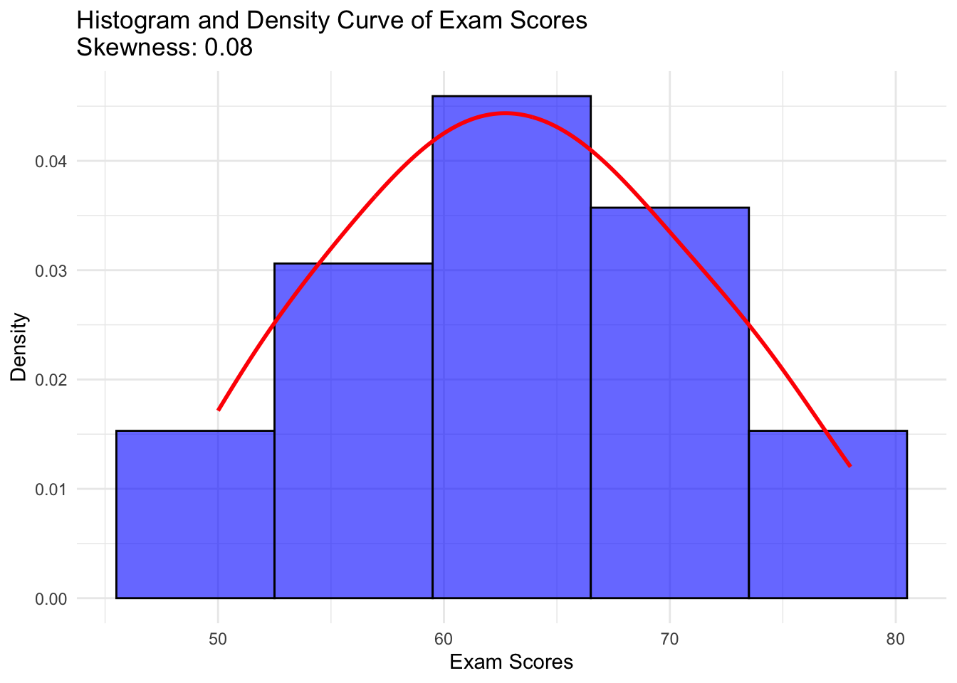
[1] -0.7368719# Load necessary libraries
library(ggplot2)
library(moments)
# Calculate skewness
exam_skewness <- skewness(exam_scores)
# Create histogram with density curve
ggplot(data.frame(exam_scores), aes(x = exam_scores)) +
geom_histogram(aes(y = after_stat(density)), bins = 5, fill = "blue", color = "black", alpha = 0.6) +
geom_density(color = "red", linewidth = 1) +
labs(title = paste("Histogram and Density Curve of Exam Scores\nSkewness:", round(exam_skewness, 2)),
x = "Exam Scores",
y = "Density") +
theme_minimal()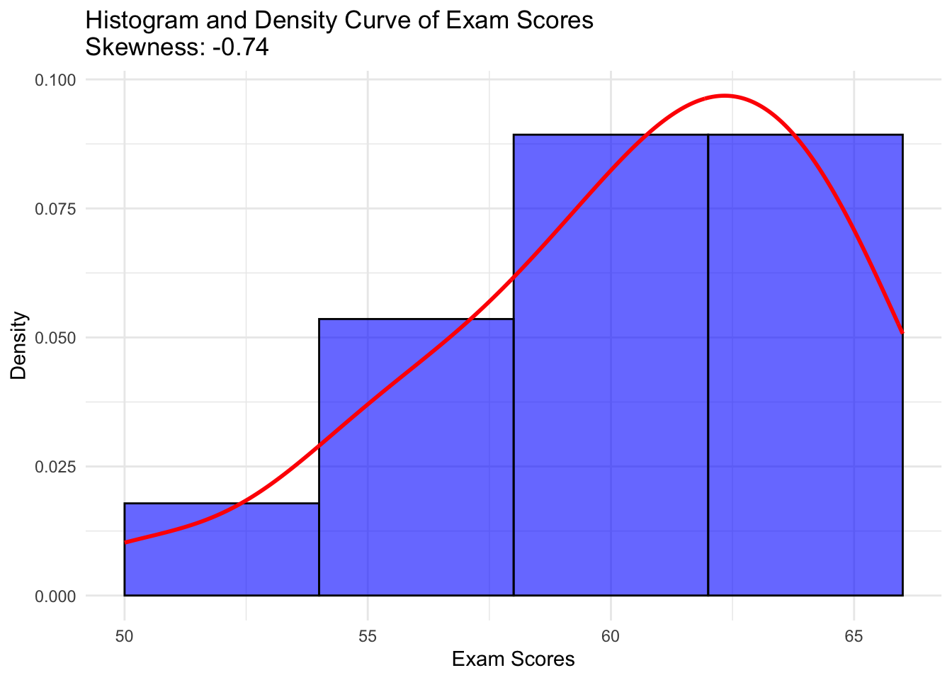
[1] 0.4172705# Load necessary libraries
library(ggplot2)
library(moments)
# Calculate skewness
exam_skewness <- skewness(exam_scores)
# Create histogram with density curve
ggplot(data.frame(exam_scores), aes(x = exam_scores)) +
geom_histogram(aes(y = after_stat(density)), bins = 5, fill = "blue", color = "black", alpha = 0.6) +
geom_density(color = "red", linewidth = 1) +
labs(title = paste("Histogram and Density Curve of Exam Scores\nSkewness:", round(exam_skewness, 2)),
x = "Exam Scores",
y = "Density") +
theme_minimal()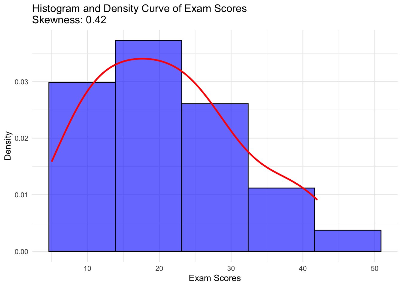
Kurtosis measures the “tailedness” of the distribution or the peakedness. It indicates how much of the data is concentrated in the tails and the peak of the distribution relative to a normal distribution.
Formula for Kurtosis: \[ Kurtosis = \frac{N(N+1) \sum (X_i - \overline{X})^4}{(N-1)(N-2)(N-3)S^4} - \frac{3(N-1)^2}{(N-2)(N-3)} \]
Where:
Kurtosis measures the “tailedness” of the distribution:
Example of Kurtosis: Consider a dataset representing the heights of a group of people. If most people are of average height, with few very short or very tall people, the distribution might be leptokurtic, indicating a peaked distribution with fat tails.
# Load necessary libraries
library(ggplot2)
library(moments)

# Define the dataset
exam_scores <- c(55, 60, 65, 65, 70, 75, 80)

# Create a dataframe
exam_data <- data.frame(Score = exam_scores)

# Plot histogram with density curve
ggplot(exam_data, aes(x = Score)) +
  geom_histogram(aes(y = after_stat(density)), bins = 5, fill = "blue", alpha = 0.5, color = "black") +
  geom_density(color = "red", linewidth = 1) +
  labs(title = "Histogram and Density Curve of Exam Scores",
       x = "Exam Scores",
       y = "Density") +
  theme_minimal()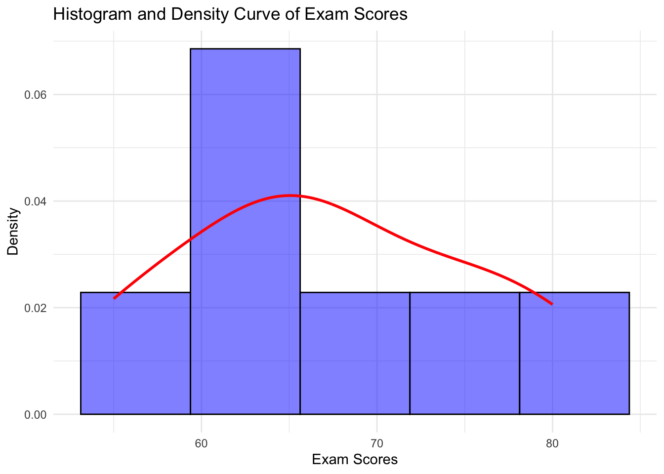
These indicate relationships between two variables. - Correlation: Measures the strength and direction of association between two variables. - Pearson’s correlation: Measures linear relationship. - Spearman’s rank correlation: Measures monotonic relationship. - Covariance: Measures the degree to which two variables vary together.
# Load necessary library
library(ggplot2)

# Scatter plot with regression line
ggplot(mtcars, aes(x = hp, y = mpg)) +
  geom_point(color = "blue", size = 3, alpha = 0.7) +  # Scatter plot points
  geom_smooth(method = "lm", color = "red", se = FALSE) +  # Regression line
  labs(title = "Scatter Plot of MPG vs Horsepower",
       x = "Horsepower (hp)",
       y = "Miles Per Gallon (mpg)") +
  theme_minimal()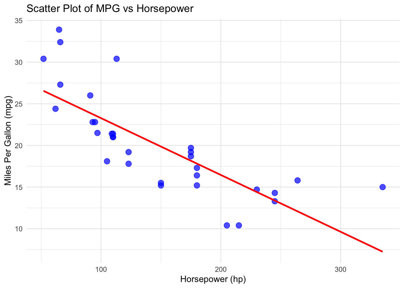
# Create a simple data frame
students <- data.frame(
  Name = c("Arun", "Arun", "Charan", "Divya", "Eswar",
           "Fathima", "Gopal", "Harini", "Ilango", "Jayanthi"),
  Age = c(25, 25, 35, 28, 22, 40, 33, 27, 31, 29),
  Height = c(5.6, 5.6, NA, 5.4, 6.0, 5.3, 5.9, 5.5, 5.7, 5.8),
  Gender = c("M", "M", NA, "F", "M", "F", "M", "F", "M", "F"),
  Marks = c(85, 85, 78, 88, 76, 95, 82, 89, 80, 91),
  Attendance = c(92, 92, 88, 90, 87, 95, 83, 89, 86, 91)
)
cor(students$Attendance , students$Marks)  # Correlation
[1] 0.711283# Load necessary library
library(ggplot2)
# Scatter plot with regression line
ggplot(students, aes(x = Attendance, y = Marks)) +
geom_point(color = "blue", size = 3, alpha = 0.7) + # Scatter plot points
geom_smooth(method = "lm", color = "red", se = FALSE) + # Regression line
labs(title = "Scatter Plot",
x = "Attendance",
y = "Marks") +
theme_minimal()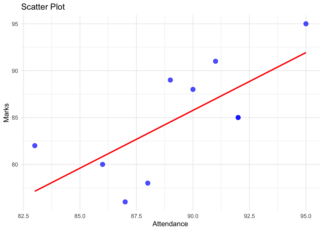
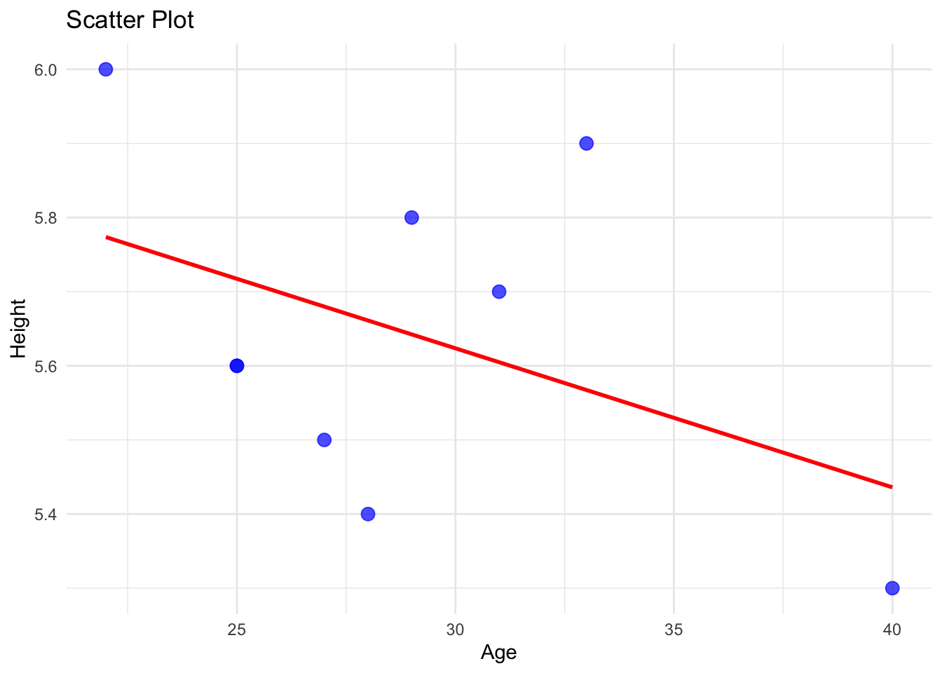
cor(students$Age , students$Height) # Correlation [1] NA# Load necessary library
library(ggplot2)
# Scatter plot with regression line
ggplot(students, aes(x = Age, y = Height)) +
geom_point(color = "blue", size = 3, alpha = 0.7) + # Scatter plot points
geom_smooth(method = "lm", color = "red", se = FALSE) + # Regression line
labs(title = "Scatter Plot",
x = "Age",
y = "Height") +
theme_minimal()